


Collages and survey results
Naturally I compared myself to Frida Kahlo this week. You?

Hi Friend,
Thank you to everyone who took the time to answer the poll questions in the last newsletter. Results shared below. But first, let’s talk about the art I made this week.
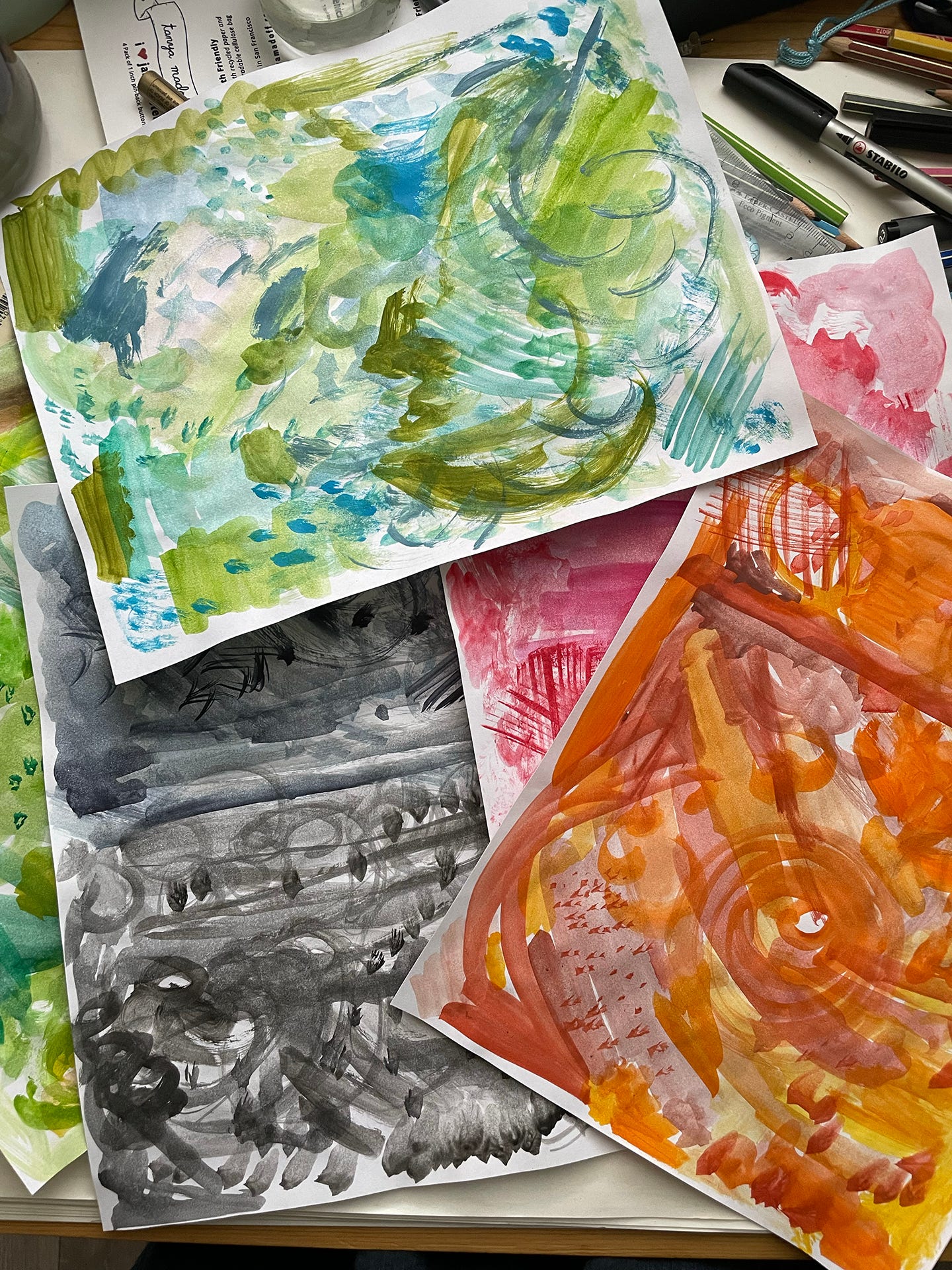
It started with painting regular paper with swathes of color. I used both watercolor and acrylic paint. This was fun and messy and felt very much like a kids project.
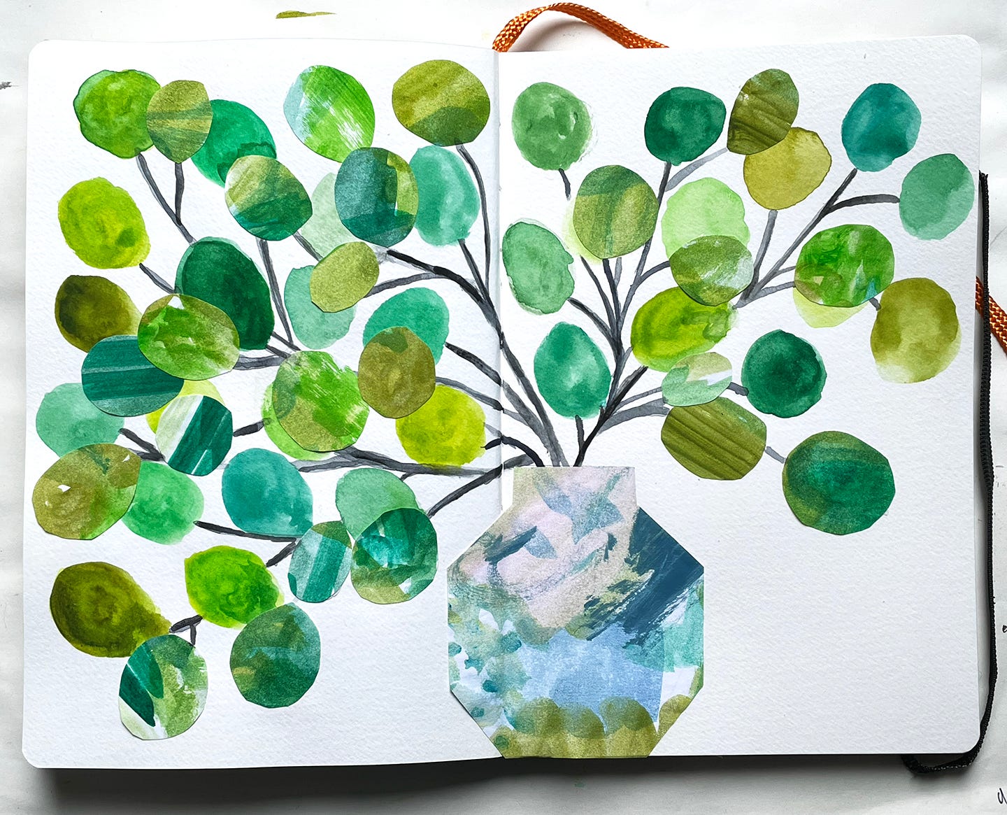
The first collage was a vase with branches and round eucalyptus type leaves. Some of the leaves are painted in watercolor directly in my notebook and others were cut out from the painted pages and glued on top for added depth and texture.
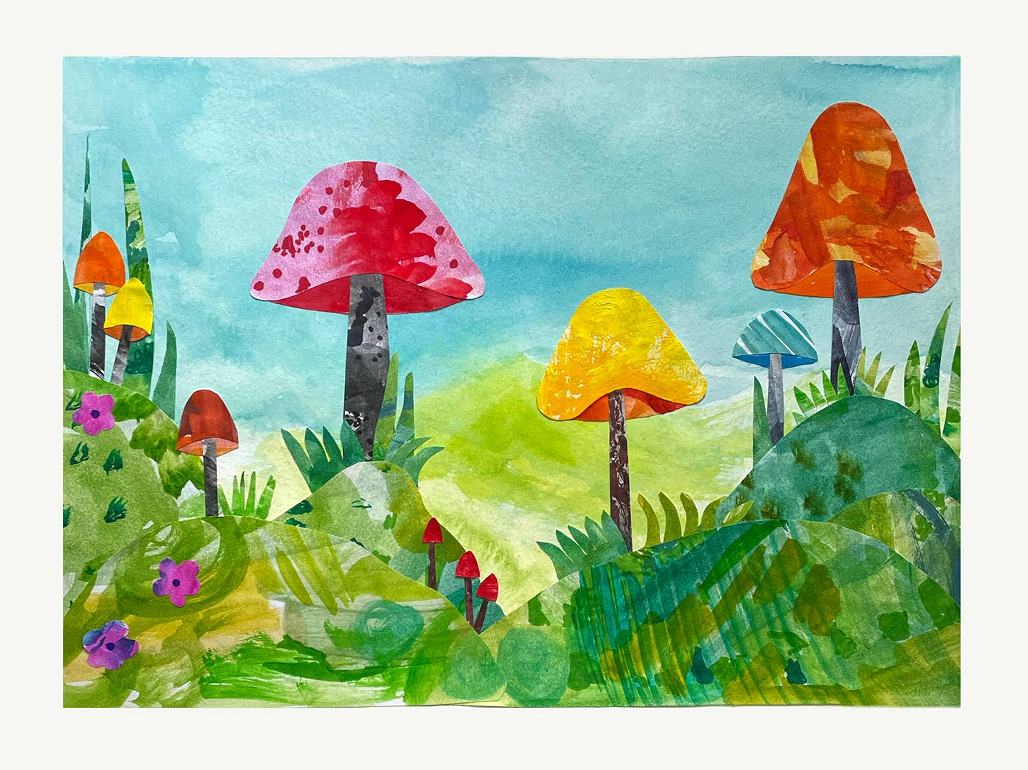
Now let’s take a journey to a magical place where mushrooms grow as tall as trees!
This one started with a watercolor background and then I added cut out mushrooms, grass, hills and flowers. I wish I could tell you that I was 100% successful at being carefree and playful during the process, but in truth I still had moments of judging myself. Like when I considered - Would Frida Kahlo make these types of collages? What would they look like if she did? I bet they would be amazing. Why aren’t I more like Frida?
Luckily that was such a ridiculous train of thought, I was able to see the humor in it right away. Plus the mushrooms are so cute, and even they know better than to take themselves so seriously.
“The Hills Are Alive with Giant Mushrooms,” sounded too much like a horror movie, so I’m just calling this one “Mushroomtopia.”
And now for the poll results!
The #1 thing I wish there was more of on Pretty in Ink is...
Black and white art 25%
Full color art 63%
Monochromatic/limited palette art 13%
Full color for the win! I had thought it would be black and white because I usually get a lot of comments on those drawings, but it’s all good because I like to make all of these things!
The #2 thing I wish there was more of on Pretty in Ink is...
Progress pictures 25%
Thoughts/feelings about the process 63%
Materials used/technical how to 13%
More thoughts and feelings! This was a surprise because I had assumed everyone else would have grown tired of hearing the back and forth conversations in my head where I compare myself to others (ie Frida above), or the ones that go something like:
—This is a cool idea…this is going to be amazing! Am I maybe a genius?!
—Oh no, I messed it up. I’m a dumpster fire/sham of an artist and human.
—I guess I’ll keep going. I mean, I may as well.
—Oh wait, I kind of like some of it.
—Maybe I’m okay and everything is fine?
Is this what you were talking about?
For those of you who didn’t take the survey and are silently screaming Noooooooooo!, that’s really on you for not speaking up.
Currently Pretty in Ink is delivered on Sundays...
Sundays are fine 100%
The tone of Pretty in Ink is sometimes deep/vulnerable and sometimes lighter/less reflective…
I like the variation in tone 100%
The above two questions each had an answer that was 100%, so that was easy.
Which movie should inspire my next set of buttons and magnets?
Heathers (1988) 14%
Pump Up the Volume (1990) 14%
Clueless (1995) 29%
All of the above 43%
I loved seeing the poll results in real time for this one! Clueless had a strong lead at the start, but I’m glad that all of the above won because I really want to make buttons from all of them.
Hope you’re having a lovely day.
xo
Tanya
These collages are so cool! Adding it my list of craft projects to experiment with.
Also a fan of the “in the process” shares 🙌🏾
I’m inspired! I’m going to share with my students how to make these two design ideas. We don’t have an art teacher, so I’m thinking of having them paint something in a similar manner that they can then incorporate into their computer animation project. Thank you for sharing!!!!